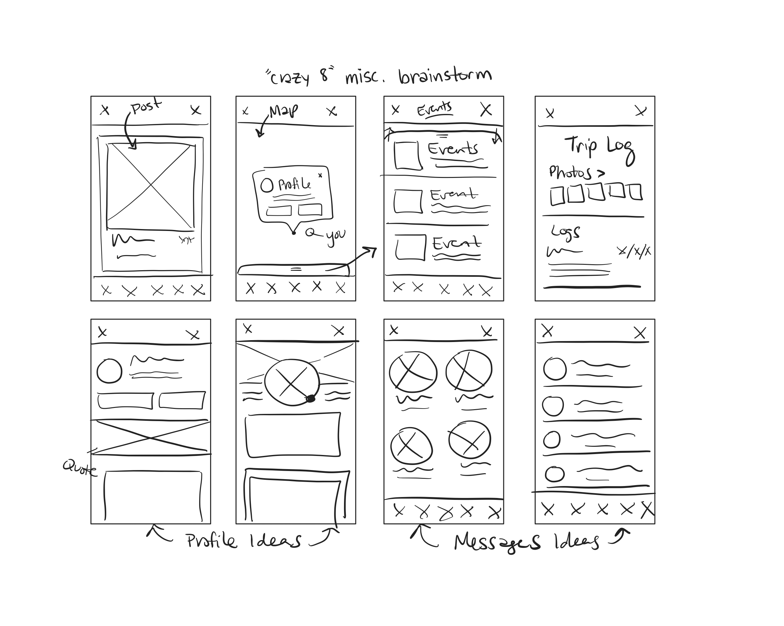
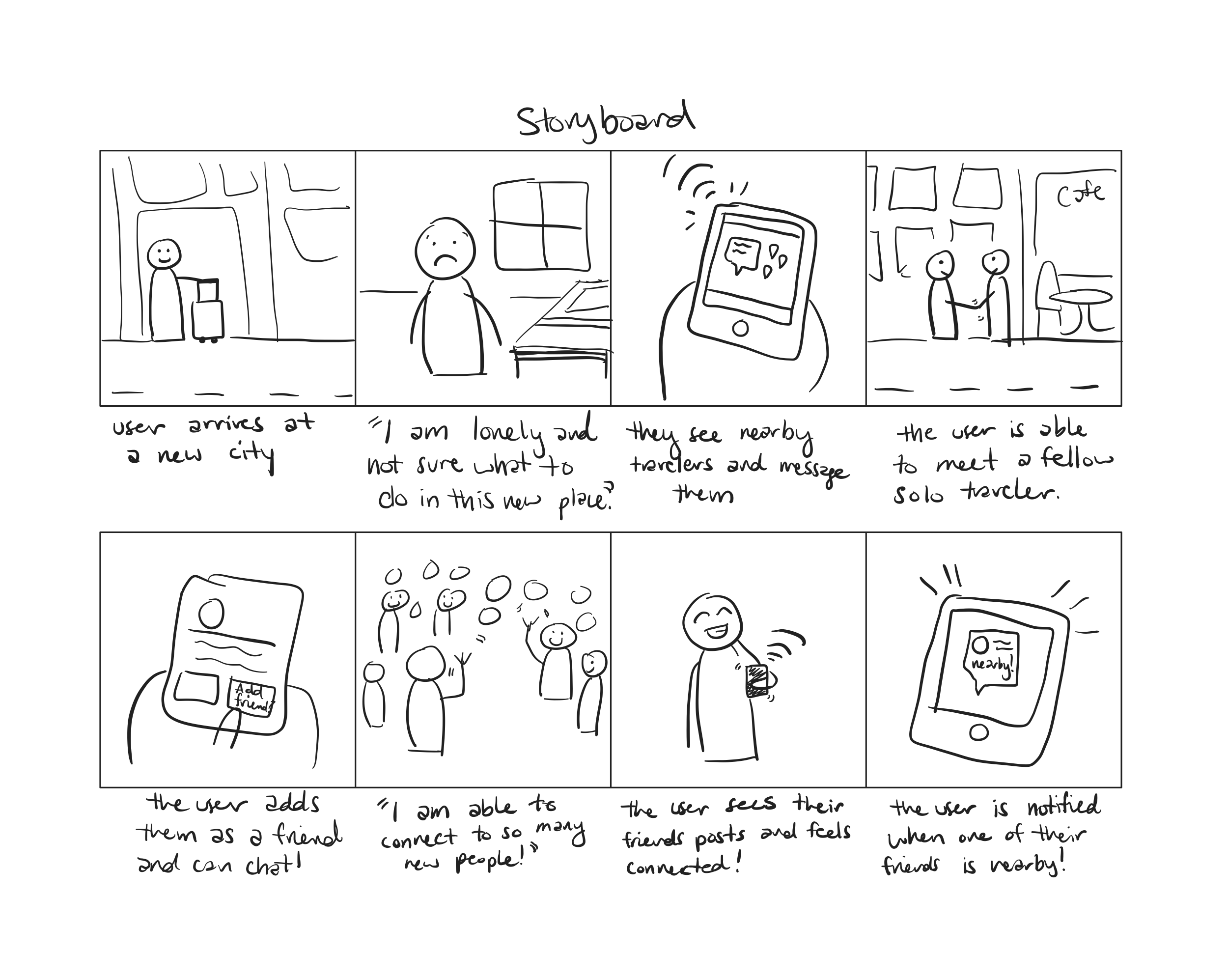
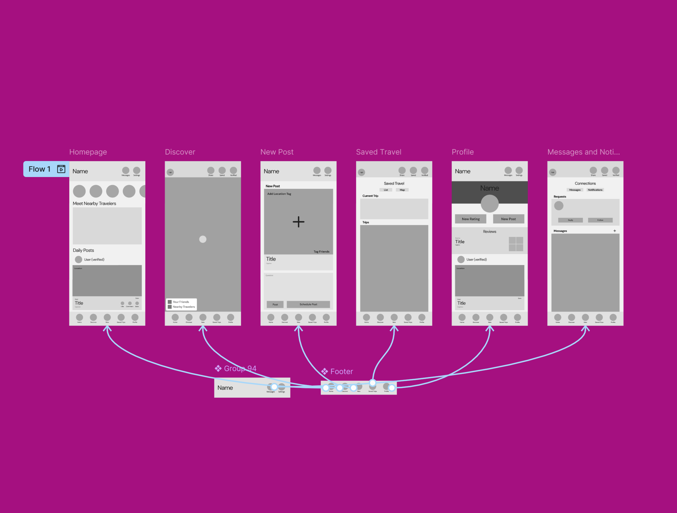
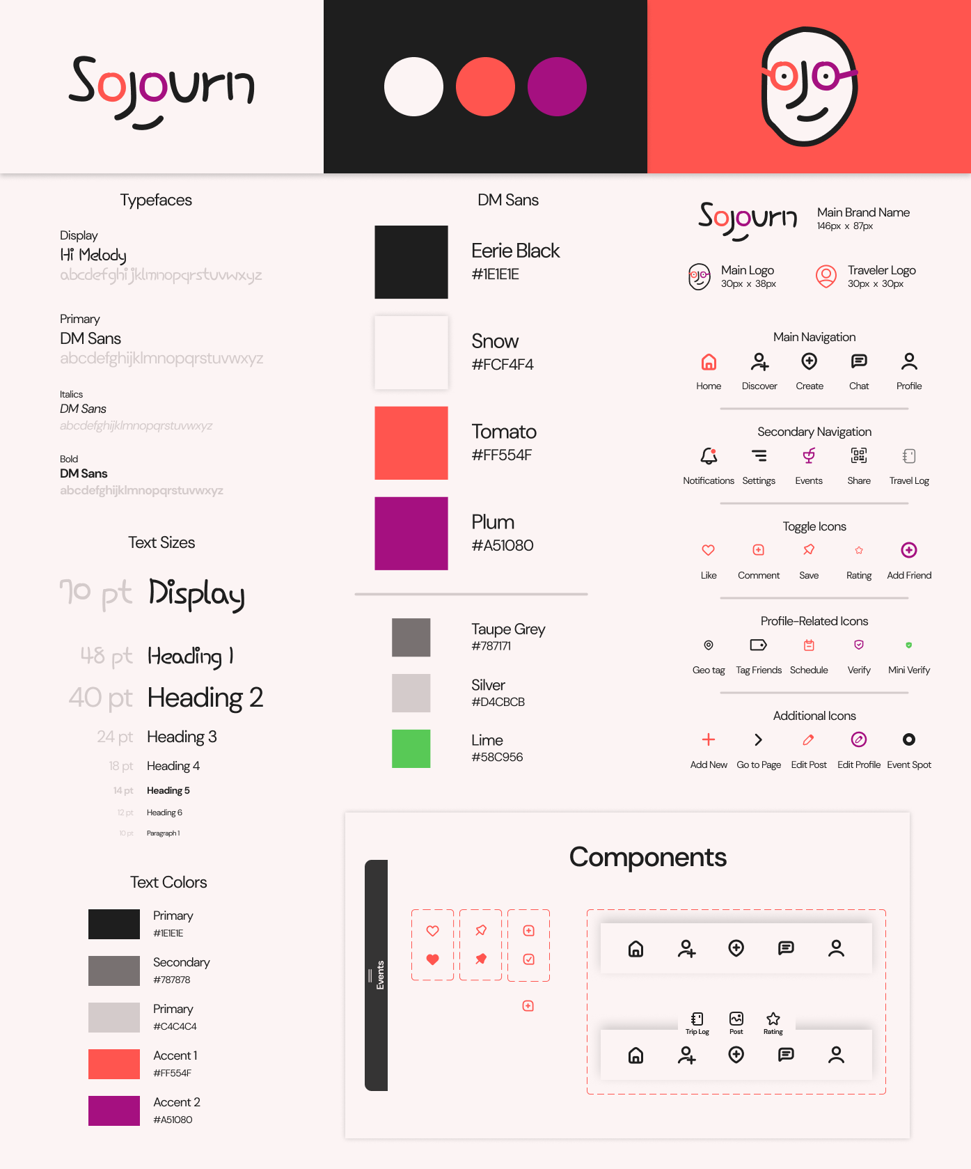
Sojourn

Overview

This project explores the design and development of a social media app tailored to solo travelers, called Sojourn, which aims to enhance user experiences by fostering safe, meaningful connections between travelers across the globe. The app design was informed by user data and social research from solo traveler demographics. Key features include a social platform, discovery map, and notetaking functionality, with the ever-present goal of building community while out in the world. The process highlighted the importance of thoughtful UX design and especially continuous user engagement in creating impactful digital products.

Challenge

Building a social media app that stood apart in its functionality, but was also extremely easy for new users to pick up on. The app needed to feel familiar, but serve its own purpose, and to be fully centered around worldwide adventures.

Goals

  • Build a social platform with explore capabilities to connect users.
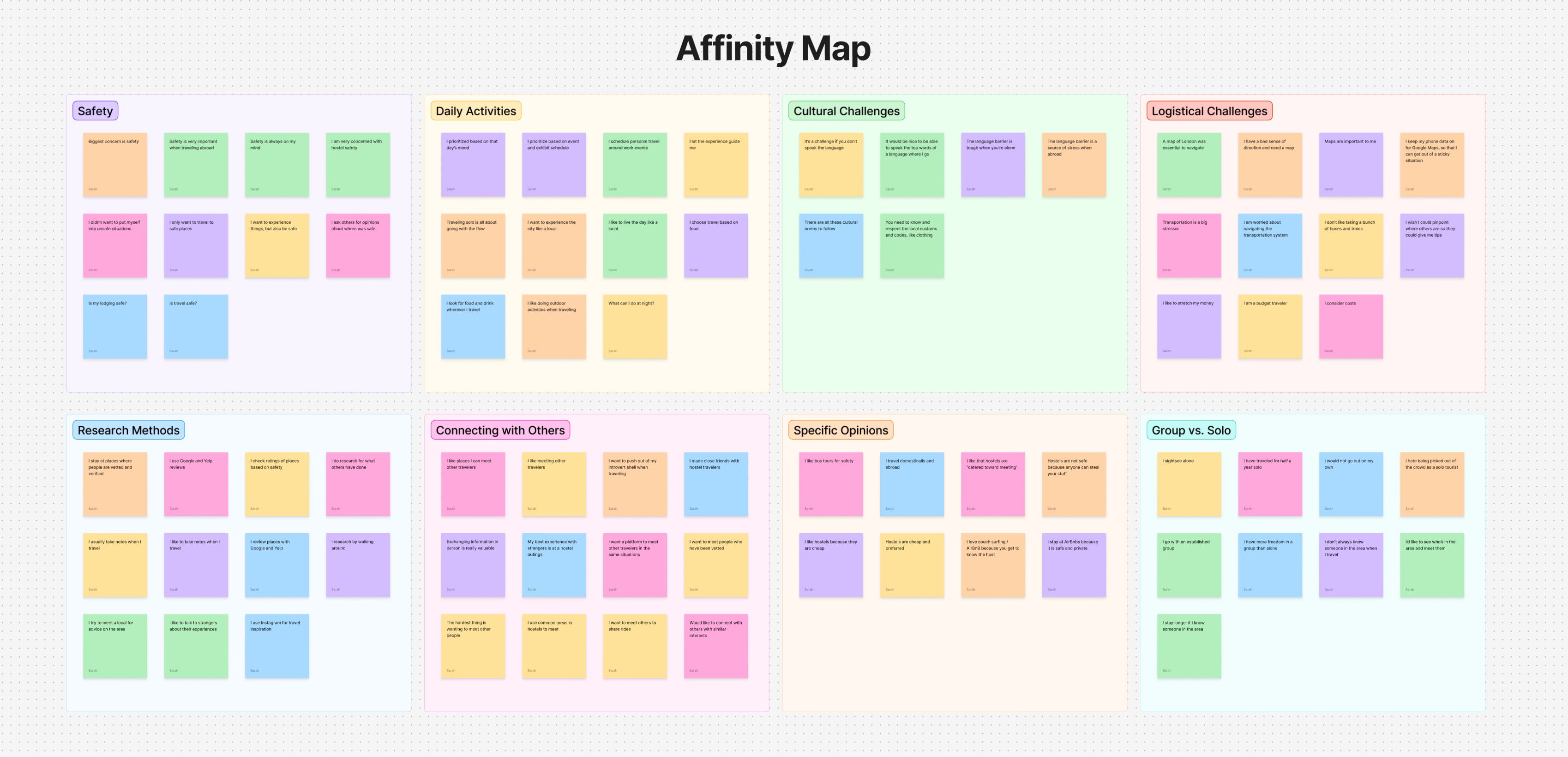
  • Utilize data-informed designs for the logsitical aspects of the app, especially pertaining to safety.
  • Incorporate user feedback in iterations and expand core features without losing the app’s primary purpose.

Role

UX Designer, UX Researcher

Duration

3 months

project image

“Traveling – it leaves you speechless, then turns you into a storyteller.”

– Ibn Battuta

Empathize and Explore

To begin, I conducted user interviews with six solo travelers to gather insights about their experiences, needs, and challenges. Each interview focused on how they planned their trips, stayed safe, connected with others, and navigated daily travel life. These interviews were essential in shaping the app's main functions, and in highlighting everyday concerns solo travelers face.

“Safety is always on my mind.”

“It's a challenge if you don't speak the language.”

“I made close friends with hostel travelers.”

“I have more freedom in a group than alone.”

“I consider costs.”

“I want to experience the city like a local.”

Affinity Mapping

From the interviews, I utilized an affinity mapping technique to identify patterns. Because of the variety of responses, creating the affinity map felt like solving a puzzle with too many right answers. Some themes, like safety, stood out immediately, while others overlapped in tricky ways.

View Affinity Map
project image

Creating Personas

After organizing the affinity map, I created personas to represent key user types. These personas helped capture the shared goals, behaviors, and frustrations of solo travelers. I found myself referencing the personas during the iteration process the most, to keep the team focused on solving the right problems.

project image project image

“We travel, some of us forever, to seek other states, other lives, other souls.”

– Anais Nin

Designing and Drafting

Once I felt I had a foundational understanding of solo travelers experiences, I began to brainstorm app layouts and various solutions to user problems. I utilized the "Crazy 8's" sketching technique, as well as creating a user storyboard, to better picture a user experiecing the digital solutions I had in mind.

project image project image

Prototyping

In the prototyping stage, I created low-fidelity wireframes based on the sketches, then developed a high-fidelity mockup using Figma. The prototype included the core features I had observed from the affinity mapping themes, like creating social posts, a discovery map, and a notetaking/rating system. As I had mentioned, it was designed to be tailored to solo travelers, but have easily recognizable elements for faster onboarding.

Prototyping Insights

  • Familiarity with Social Media Layouts – The app was designed to resemble popular platforms like Instagram to reduce the learning curve for users.
  • Solo Traveler Needs – Features like the discovery map, rating system, and travel logs were prioritized to support connection, safety, and community during solo trips.
  • Clean and Modern Aesthetic – A flat, bright design with modern UI elements was chosen to create a visually appealing and intuitive user experience.
project image

User Testing

During user testing, participants completed tasks using the prototype while I observed and recorded their feedback. Their insights revealed navigation issues and usability challenges, which guided key design improvements in the next iteration to enhance overall user experience.

User Insight

Navigation Improvements Needed – Users struggled to find profiles and key features, leading to added profile CTAs and more clickable elements throughout the app.

“I was so confused on where to find [this discover page], that took forever.”

User Insight

Icon Confusion – The map icon caused confusion, so it was removed and replaced with a clearer chat icon to improve intuitiveness.

“It’s weird that this is a map icon but the map is on another page.”

User Insight

Event Page Enhancements – Showing friends attending events helped users feel more confident and encouraged social interaction, aligning with the app’s core purpose.

“It would be so cool if we could see which friends are going to the events, or even friends of friends.”

“I’m in love with cities I’ve never been to and people I’ve never met.”

– John Green

Deliverables

After gleaning valuable insights from the user feedback and implementing some specific feature changes, I created two deliverables to finalize this project. The final products for this project include a detailed brand guide and a final prototype.

Brand Guide

I focused on creating a clean, modern brand guide with bright accent colors to evoke a sense of excitement and adventure. The logo and visual elements are meant to be simple and playful, and the logo plays off of the Sojourn accent font and text. I am especially proud of this aspect of the project!

project image

Final Prototype

The final prototype, as I mentioned, integrates user feedback from the user testing to improve usability and flow. Key updates include more concise and embedded navigation, clearer icons, and additional primary features. The chat feature was updated, and the new event tab now shows attending friends. These changes reflect real user needs, making the app more intuitive.

project image

Reflection

Reflecting on this project, I’m really proud of the final result and of how much I learned throughout the design process. One of the biggest takeaways was the importance of user feedback; while I was initially surprised that none of the success metrics passed, the insights I gained were incredibly valuable for iteration. I also learned just how detailed and thoughtful usability testing needs to be, and how even small changes (like adding profile links or rethinking navigation) can make a big impact on the user experience. Building the mockup was time-consuming but rewarding, and I enjoyed the challenge of making something both functional and visually appealing. Overall, this project showed me how iterative, collaborative, and creative UX design can be.

Project Takeaways

In conclusion, this project provided valuable experience in user-centered design, from gathering insights through interviews to refining the app through iterative testing. While challenges arose, the feedback-driven process led to significant improvements, and the experience deepened my understanding of how to create effective, user-friendly digital products.

“Not all those who wander are lost.”

– J.R.R. Tolkien